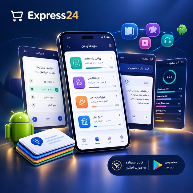
اپلیکیشن اندرویدی فلشکارت آموزشی CSS for Fleet Management Organizations
🎓 دوره آموزشی جامع
📚 اطلاعات دوره
عنوان دوره: دوره CSS for Fleet Management Organizations
موضوع کلی: برنامه نویسی
موضوع میانی: CSS
📋 سرفصلهای دوره
- 1. What is CSS and Why is it Essential for Fleet Applications?
- 2. Integrating CSS into Your Fleet Management HTML (Internal, External, Inline)
- 3. Understanding CSS Syntax: Rules, Selectors, Properties, Values
- 4. Developer Tools for Inspecting and Debugging Fleet UI Styles
- 5. Best Practices for Organizing CSS Files in Large Projects
- 6. Type Selectors: Styling Basic HTML Elements (e.g., `<body>`, `<h1>`, `<p>`)
- 7. Class Selectors: Applying Styles to Specific UI Components (e.g., `.vehicle-card`, `.driver-status`)
- 8. ID Selectors: Targeting Unique Elements in a Fleet Dashboard
- 9. Attribute Selectors: Styling Elements Based on HTML Attributes (e.g., `[data-status="active"]`)
- 10. Universal Selector: Global Styles for Your Fleet Application
- 11. Grouping Selectors: Applying Common Styles Efficiently
- 12. Descendant Selectors: Targeting Nested Elements (e.g., `table td`)
- 13. Child Selectors: More Specific Styling for Direct Children
- 14. Sibling Selectors: Styling Adjacent Elements
- 15. The Cascade, Specificity, and Inheritance: Mastering CSS Priority
- 16. Understanding the CSS Box Model: Content, Padding, Border, Margin
- 17. Controlling Content Area Dimensions (`width`, `height`, `min/max-width/height`)
- 18. Adding Padding: Spacing Inside Fleet UI Elements
- 19. Applying Borders: Visual Separators and Emphasizers
- 20. Managing Margins: Spacing Between Fleet UI Elements
- 21. `box-sizing`: The `border-box` Advantage for Predictable Layouts
- 22. Visualizing the Box Model with Browser DevTools
- 23. `display: block`: Block-Level Elements for Main Sections
- 24. `display: inline`: Inline Elements for Text and Small Components
- 25. `display: inline-block`: Combining Block and Inline Behaviors
- 26. `display: none` vs. `visibility: hidden`: Hiding Elements in Fleet UIs
- 27. Understanding the Normal Document Flow
- 28. Setting Text Colors: Enhancing Readability for Operational Staff
- 29. Background Colors: Defining Sections and Cards
- 30. Background Images: Adding Branding or Thematic Visuals
- 31. Background Properties: `size`, `repeat`, `position`, `attachment`
- 32. Gradients: Creating Subtle Visual Depth for UI Elements
- 33. Opacity and RGBA Colors: Transparent Elements for Overlays
- 34. HEX, RGB, HSL Color Formats: Choosing the Right Palette
- 35. Implementing Brand Colors Consistently with CSS
- 36. `font-family`: Choosing Typefaces for Professional Fleet Applications
- 37. `font-size`: Ensuring Legibility Across Devices and User Roles
- 38. `font-weight`: Emphasizing Key Information (e.g., "Critical Alert")
- 39. `line-height`: Improving Vertical Spacing and Readability
- 40. `text-align`, `text-decoration`, `text-transform`: Text Presentation
- 41. `letter-spacing` and `word-spacing`: Fine-Tuning Text Appearance
- 42. Custom Fonts (`@font-face`): Integrating Brand-Specific Typography
- 43. Icon Fonts vs. SVG Icons for Fleet Management Visuals
- 44. Absolute Units: `px` for Pixel-Perfect Control (when needed)
- 45. Relative Units: `em` and `rem` for Scalable Typography
- 46. Viewport Units: `vw`, `vh`, `vmin`, `vmax` for Responsive Full-Screen Elements
- 47. Percentage Units: Relative Sizing for Fluid Layouts
- 48. `calc()` Function: Dynamic Calculations in CSS
- 49. Understanding `auto` and `inherit` Values
- 50. `position: static`, `relative`, `absolute`, `fixed`, `sticky`
- 51. Using `top`, `right`, `bottom`, `left` for Positioning Elements
- 52. `z-index`: Managing Stacking Order for Overlays and Modals
- 53. Introduction to Floats: Layout for Sidebars and Multi-Column Content
- 54. Clearing Floats: Techniques to Prevent Layout Issues
- 55. Creating Simple Grid-like Layouts with Floats (Legacy approach)
- 56. Understanding Flex Containers and Flex Items
- 57. `display: flex`: Activating Flexbox Layout
- 58. `flex-direction`: Arranging Items in Rows or Columns
- 59. `justify-content`: Horizontal Alignment of Flex Items
- 60. `align-items`: Vertical Alignment of Flex Items
- 61. `flex-wrap`: Allowing Flex Items to Wrap to New Lines
- 62. `align-content`: Vertical Alignment of Wrapped Lines
- 63. `flex-grow`, `flex-shrink`, `flex-basis`: Controlling Item Sizing
- 64. `order`: Reordering Flex Items for Different Viewports
- 65. Building a Responsive Navigation Bar with Flexbox
- 66. Creating Dynamic Card Layouts for Vehicle/Driver Information
- 67. Understanding Grid Containers and Grid Items
- 68. `display: grid`: Activating CSS Grid Layout
- 69. `grid-template-columns` and `grid-template-rows`: Defining Grid Structure
- 70. `grid-gap`, `column-gap`, `row-gap`: Spacing Between Grid Cells
- 71. `fr` Unit: Fractional Space for Responsive Grid Tracks
- 72. `grid-auto-columns`, `grid-auto-rows`, `grid-auto-flow`: Implicit Grid Tracks
- 73. `grid-template-areas`: Naming Grid Areas for Semantic Layouts
- 74. Placing Grid Items with `grid-column` and `grid-row`
- 75. `justify-items`, `align-items`, `justify-content`, `align-content`: Item and Track Alignment
- 76. Building a Full Dashboard Layout with CSS Grid
- 77. Creating Complex Reports and Data Tables with Grid
- 78. Principles of Responsive Web Design for Fleet Operators
- 79. The Viewport Meta Tag: Essential for Mobile Responsiveness
- 80. Media Queries: Customizing Styles Based on Device Characteristics
- 81. Breakpoints: Defining Where Layouts Change for Different Devices (Desktop, Tablet, Mobile, Large Screens)
- 82. Mobile-First vs. Desktop-First Strategies for Fleet UI Development
- 83. Flexible Images and Embedded Media in Responsive Designs
- 84. Responsive Typography: Scaling Text for Different Screen Sizes
- 85. Testing Responsiveness in Browser Developer Tools
- 86. Pseudo-classes: `:hover`, `:focus`, `:active` for Interactive Elements
- 87. Pseudo-classes: `:first-child`, `:last-child`, `:nth-child` for List Styling
- 88. Pseudo-elements: `::before` and `::after` for Custom Icons and Decorators
- 89. CSS Transitions: Smooth Animations for State Changes (e.g., button hovers)
- 90. CSS Transforms (2D): `translate`, `rotate`, `scale`, `skew` for subtle effects
- 91. CSS Transforms (3D): Basic 3D effects for UI elements
- 92. CSS Animations (`@keyframes`): Creating Dynamic Visual Feedback (e.g., loading spinners, alerts)
- 93. Custom Properties (CSS Variables): Global Theming and Branding for Fleet Applications
- 94. Using `var()` to Apply Custom Properties Across Stylesheets
- 95. Filters: `blur`, `grayscale`, `sepia` for Image and UI Effects
- 96. Object-fit and Object-position: Controlling Image Sizing within Containers
- 97. CSS Preprocessors (Sass/Less): Introduction to Variables, Mixins, Nesting
- 98. CSS Methodologies (BEM, SMACSS): Structuring Styles for Large Teams
- 99. Performance Optimization: Minification, Critical CSS, Asset Loading Strategies
- 100. Accessibility (A11y) in CSS: Ensuring Usability for All Fleet Personnel
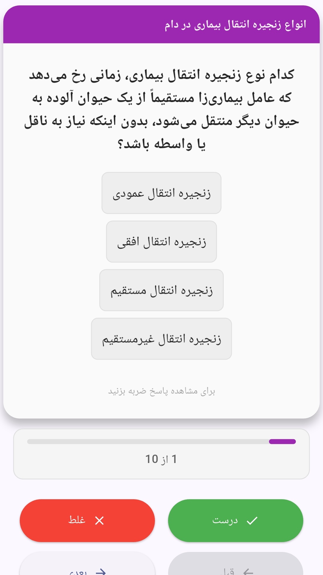
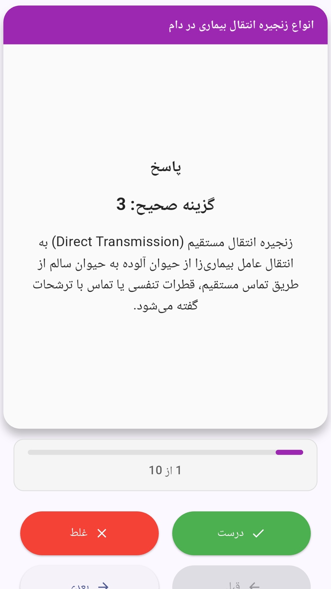
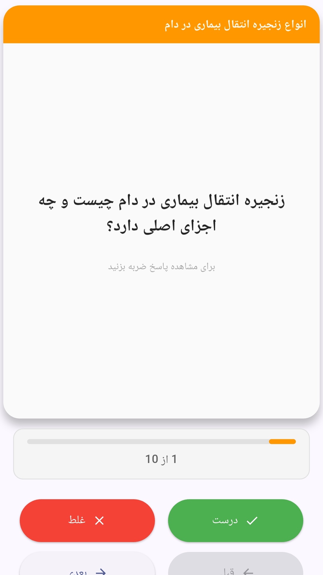
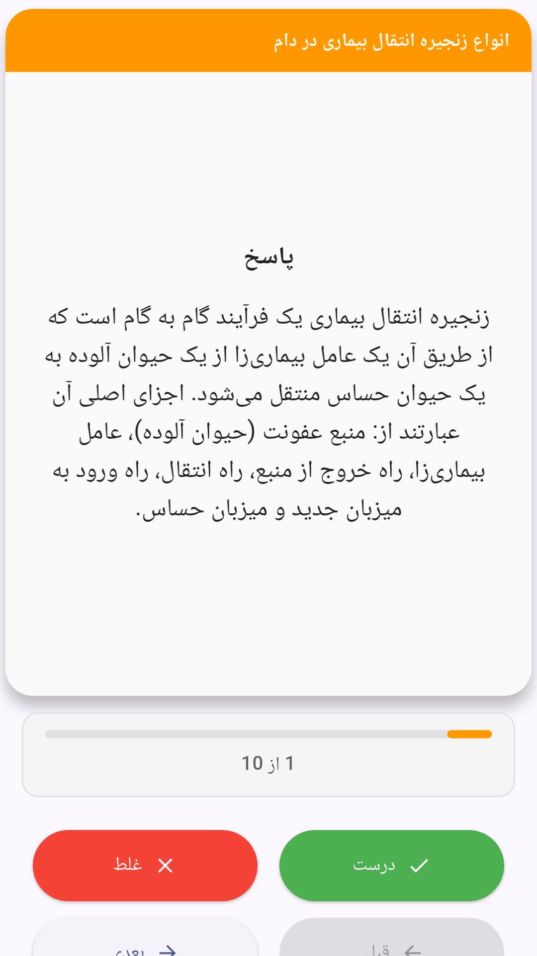
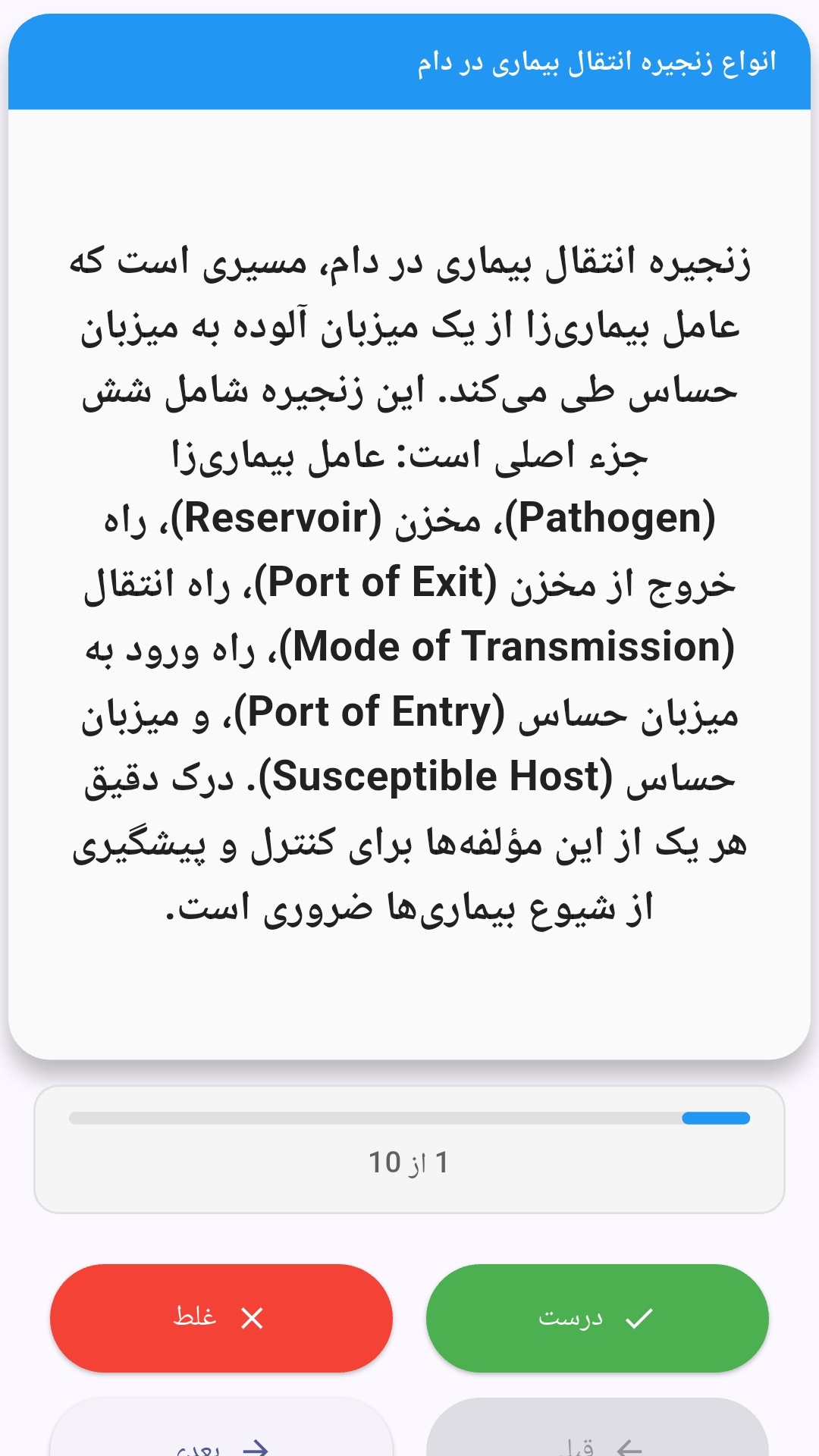
این اپلیکیشن فارسی برای یادگیری و مرور محتوای آموزشی از طریق فلشکارت طراحی شده است. کارتها را یکییکی مرور کنید، پاسخ پرسشها را به یاد بیاورید و نتیجه هر پاسخ را ثبت کنید. محتوای دوره پس از نصب درون برنامه در دسترس است تا برای مطالعه روزمره معمولاً به اتصال مداوم اینترنت نیاز نداشته باشید.
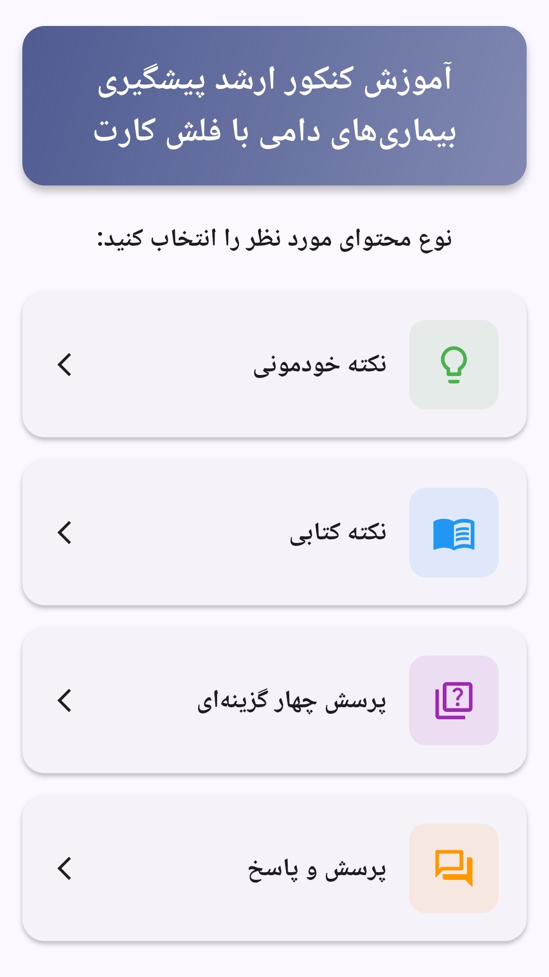
محتوای آموزشی در قالبهای متنوع ارائه میشود تا هم برای یادگیری مفاهیم جدید و هم برای تثبیت آموختهها قابل استفاده باشد.
- رابط کاربری فارسی و راستچین با فونت وزیر.
- تم روشن و تیره مطابق تنظیمات سیستم.
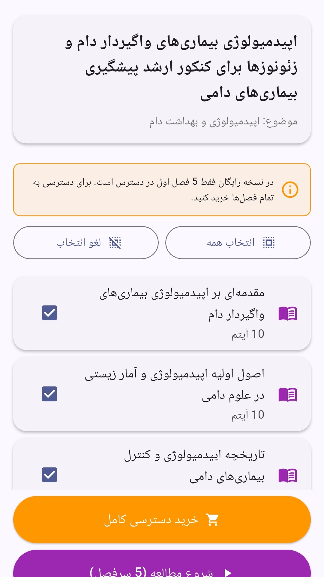
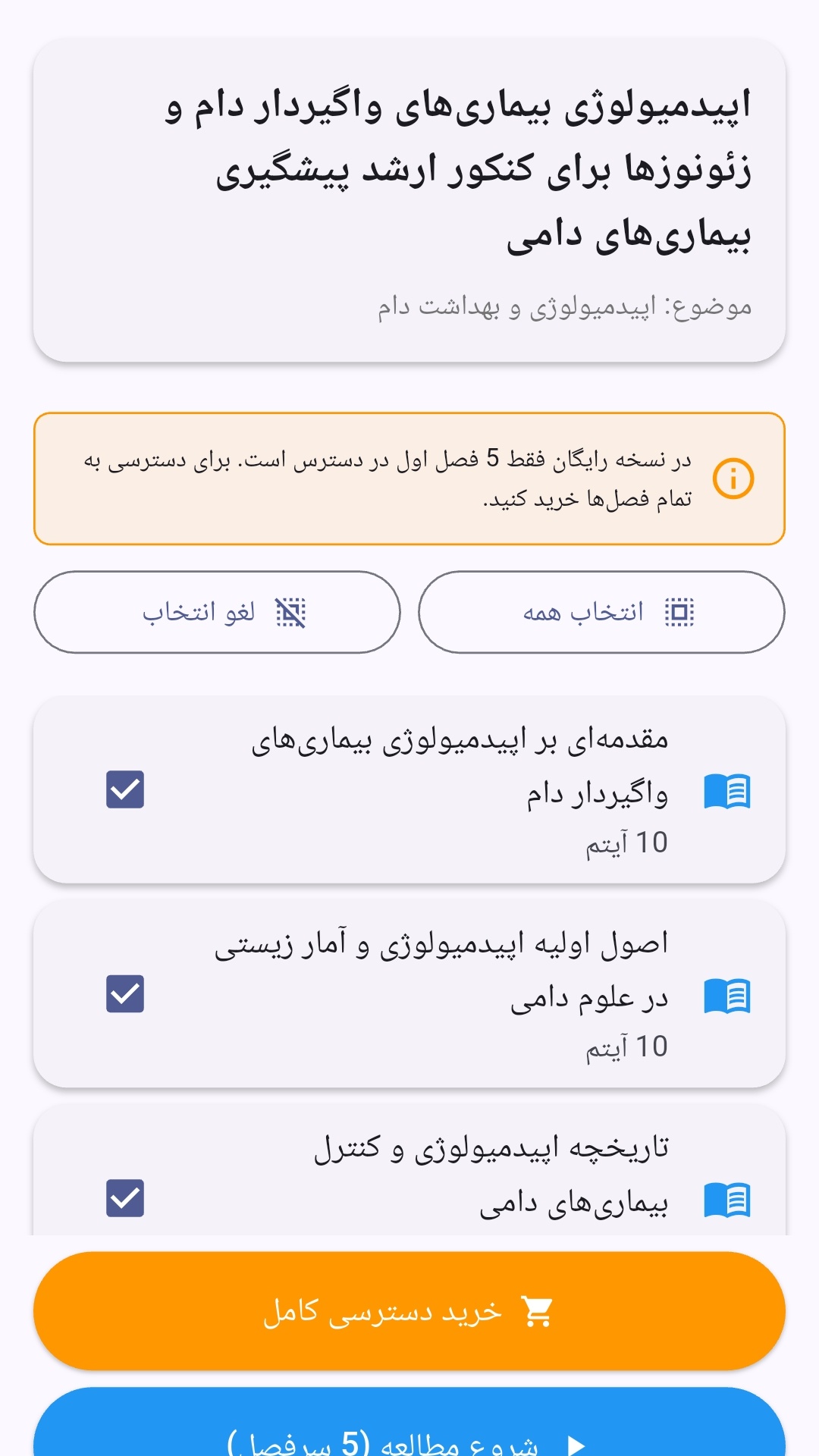
- صفحهبندی ساده برای انتخاب دوره و شروع مرور.
- نمایش تعداد دفعات مرور هر فصل.
- انتخاب چند فصل برای مرور همزمان.
- امکان تمرکز بر فصلهایی که هنوز مرور نشدهاند.
این اپلیکیشن برای دانشآموزان، دانشجویان، داوطلبان آزمونها و علاقهمندان به یادگیری طراحی شده است؛ بهویژه کسانی که میخواهند مطالب آموزشی را در زمانهای کوتاه مرور کنند، دانستههای خود را بسنجند و مطالعه منظمتری داشته باشند.
نظرات
هنوز نظری ثبت نشده است.
وارد شوید تا نظر ثبت کنید.