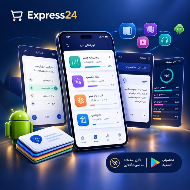
اپلیکیشن اندرویدی فلشکارت آموزشی CSS for Workforce Planning
🎓 دوره آموزشی جامع
📚 اطلاعات دوره
عنوان دوره: دوره CSS for Workforce Planning
موضوع کلی: برنامه نویسی
موضوع میانی: CSS
📋 سرفصلهای دوره
- 1. What is CSS and Why is it Important?
- 2. Setting Up Your Development Environment
- 3. Basic CSS Syntax and Rulesets
- 4. How to Add CSS to HTML: Inline, Internal, External Styles
- 5. Understanding the Cascade: Order, Origin, Importance
- 6. Specificity: How CSS Rules Are Prioritized
- 7. Inheritance: Passing Styles Down the Tree
- 8. CSS Selectors: Type, Class, ID, Universal
- 9. Grouping Selectors and Chaining Selectors
- 10. Basic CSS Properties: Color and Background-Color
- 11. Working with Text: Font-Family, Font-Size, Font-Weight
- 12. Text Alignment, Decoration, and Transformation
- 13. Line-Height and Letter/Word Spacing
- 14. Understanding the CSS Box Model: Content, Padding, Border, Margin
- 15. Controlling Element Dimensions: Width and Height
- 16. The Box-Sizing Property: `content-box` vs `border-box`
- 17. Background Images and Properties (Repeat, Position, Size)
- 18. Gradients: Linear and Radial
- 19. Border Properties: Style, Width, Color, Radius
- 20. Lists: Styling Markers and List Item Position
- 21. Tables: Styling Borders, Padding, and Alignment
- 22. Links and Buttons: Basic Hover and Active States
- 23. Forms: Styling Input Fields and Labels
- 24. Display Property: Block, Inline, and Inline-Block
- 25. Hiding Elements: `display: none` vs `visibility: hidden`
- 26. Overflow Property: Visible, Hidden, Scroll, Auto
- 27. Opacity and Transparency
- 28. Z-Index for Stacking Contexts
- 29. Outline Property for Accessibility and Styling
- 30. Cursor Property and Custom Cursors
- 31. Floats for Layout: Left and Right
- 32. Clearing Floats: Clearfix Techniques
- 33. Understanding Relative Positioning
- 34. Absolute Positioning for Element Overlays
- 35. Fixed Positioning for Persistent Elements
- 36. Sticky Positioning for Dynamic Scrolling Effects
- 37. Introduction to Flexbox: The Flexible Box Layout Module
- 38. Flex Container Properties: `display`, `flex-direction`, `flex-wrap`
- 39. Justifying Content: `justify-content`
- 40. Aligning Items: `align-items` and `align-content`
- 41. Flex Item Properties: `flex-grow`, `flex-shrink`, `flex-basis`, `flex`
- 42. Order Property for Reordering Flex Items
- 43. Introduction to CSS Grid Layout
- 44. Grid Container Properties: `display: grid`, `grid-template-columns`, `grid-template-rows`
- 45. Defining Grid Areas with `grid-template-areas`
- 46. Placing Grid Items: `grid-column`, `grid-row`, `grid-area`
- 47. `gap` Property for Spacing in Grid and Flex
- 48. Aligning Grid Items: `justify-items`, `align-items`, `place-items`
- 49. `repeat()`, `minmax()`, and `fr` Units in Grid
- 50. Multi-Column Layouts with CSS
- 51. Attribute Selectors: Targeting Elements by Attributes
- 52. Combinators: Descendant, Child, Adjacent Sibling, General Sibling
- 53. Pseudo-Classes: `:hover`, `:active`, `:focus`, `:visited`, `:link`
- 54. Structural Pseudo-Classes: `:first-child`, `:last-child`, `:nth-child`
- 55. `:not()`, `:empty()`, `:only-child` Pseudo-Classes
- 56. UI State Pseudo-Classes: `:checked`, `:enabled`, `:disabled`, `:read-only`
- 57. Pseudo-Elements: `::before`, `::after` for Generated Content
- 58. `::first-letter`, `::first-line`, `::selection`
- 59. Custom Properties (CSS Variables): Defining and Using
- 60. Scoping and Fallbacks for Custom Properties
- 61. CSS Transitions: Property, Duration, Timing Function
- 62. Transition Delay and Multiple Transitions
- 63. D Transforms: `translate()`, `rotate()`, `scale()`, `skew()`
- 64. `transform-origin` and `transform-style`
- 65. D Transforms: `perspective()`, `rotateX()`, `rotateY()`, `rotateZ()`
- 66. Introduction to Keyframe Animations
- 67. Animation Properties: `name`, `duration`, `timing-function`, `delay`
- 68. Animation Iteration Count, Direction, Fill Mode
- 69. `transition` vs `animation`: Choosing the Right Tool
- 70. Performance Considerations for Animations and Transitions
- 71. Introduction to Responsive Web Design (RWD)
- 72. Understanding the Viewport Meta Tag
- 73. Basic Media Queries: `min-width`, `max-width`, `orientation`
- 74. Advanced Media Queries: `resolution`, `prefers-color-scheme`, `prefers-reduced-motion`
- 75. Mobile-First Approach to RWD
- 76. Fluid Images and Videos: `max-width: 100%`
- 77. Using the `picture` Element and `srcset` for Responsive Images
- 78. Relative Units for Responsiveness: `em`, `rem`, `vw`, `vh`
- 79. Mathematical Functions: `calc()`, `min()`, `max()`, `clamp()`
- 80. Designing for Various Devices and Accessibility Needs
- 81. CSS Methodologies: Introduction to BEM (Block, Element, Modifier)
- 82. Implementing BEM for Component-Based Styling
- 83. SMACSS: Scalable and Modular Architecture for CSS
- 84. OOCSS: Object-Oriented CSS Principles
- 85. Atomic CSS: Utility-First Approach Concepts
- 86. Organizing Your CSS: The 7-1 Pattern
- 87. ITCSS: Inverted Triangle CSS for Scalability
- 88. Introduction to CSS Preprocessors: Sass/SCSS Basics
- 89. Variables, Mixins, and Nesting in Preprocessors
- 90. Using PostCSS for Advanced CSS Processing
- 91. CSS Linting with Stylelint for Consistency
- 92. Critical CSS: Improving Initial Page Load
- 93. Minification and Gzip Compression of CSS Files
- 94. Understanding Browser Rendering Paths and CSS Impact
- 95. Optimizing CSS Selectors for Performance
- 96. Web Accessibility (WCAG) and CSS: Semantic Structure
- 97. Designing for Keyboard Navigation: Focus Styles
- 98. Color Contrast Best Practices for Readability
- 99. Implementing `prefers-reduced-motion` for User Experience
- 100. Using `aria-*` Attributes with CSS for Enhanced Semantics
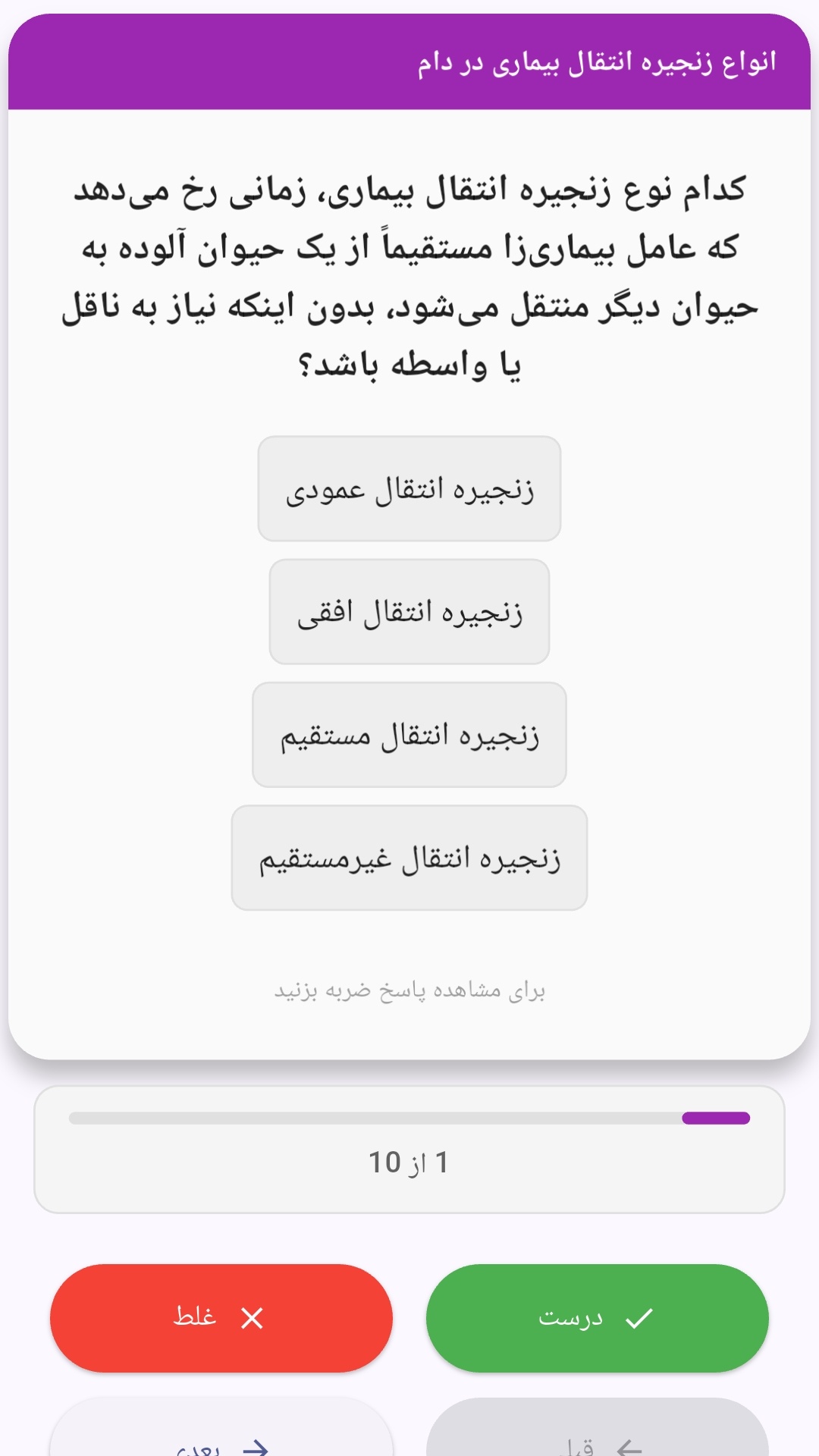
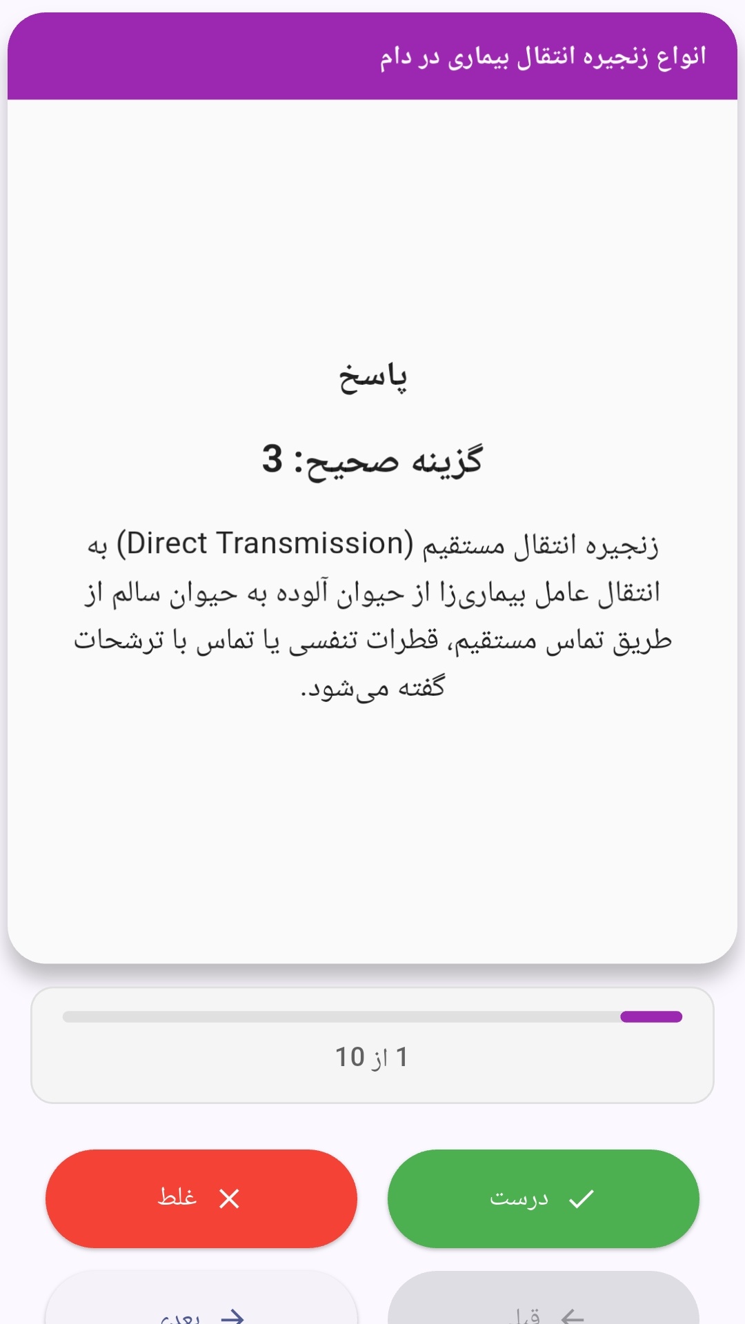
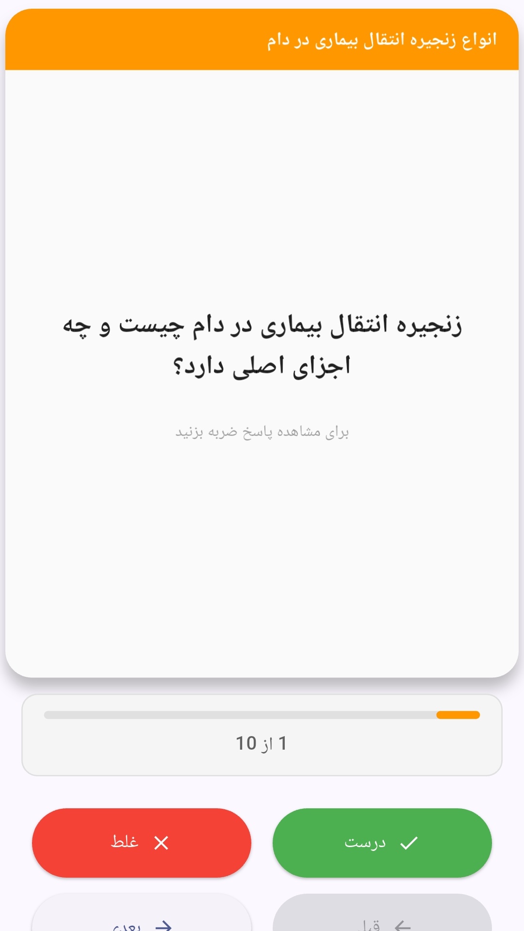
این اپلیکیشن فارسی برای یادگیری و مرور محتوای آموزشی از طریق فلشکارت طراحی شده است. کارتها را یکییکی مرور کنید، پاسخ پرسشها را به یاد بیاورید و نتیجه هر پاسخ را ثبت کنید. محتوای دوره پس از نصب درون برنامه در دسترس است تا برای مطالعه روزمره معمولاً به اتصال مداوم اینترنت نیاز نداشته باشید.
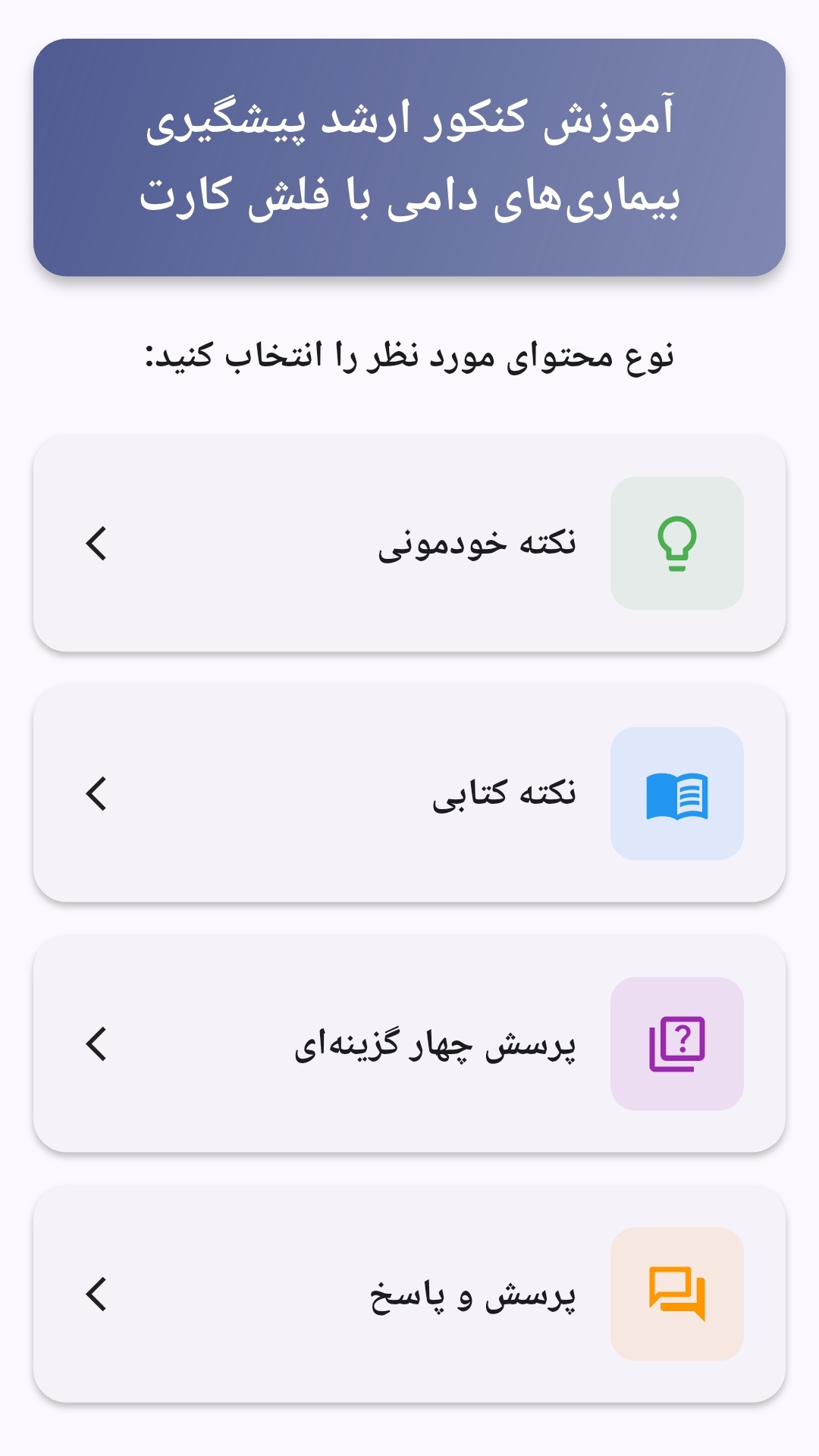
محتوای آموزشی در قالبهای متنوع ارائه میشود تا هم برای یادگیری مفاهیم جدید و هم برای تثبیت آموختهها قابل استفاده باشد.
- رابط کاربری فارسی و راستچین با فونت وزیر.
- تم روشن و تیره مطابق تنظیمات سیستم.
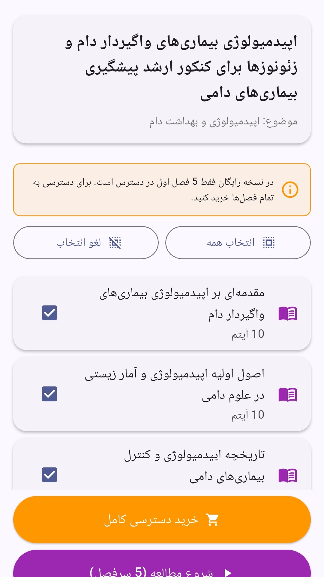
- صفحهبندی ساده برای انتخاب دوره و شروع مرور.
- نمایش تعداد دفعات مرور هر فصل.
- انتخاب چند فصل برای مرور همزمان.
- امکان تمرکز بر فصلهایی که هنوز مرور نشدهاند.
این اپلیکیشن برای دانشآموزان، دانشجویان، داوطلبان آزمونها و علاقهمندان به یادگیری طراحی شده است؛ بهویژه کسانی که میخواهند مطالب آموزشی را در زمانهای کوتاه مرور کنند، دانستههای خود را بسنجند و مطالعه منظمتری داشته باشند.
نظرات
هنوز نظری ثبت نشده است.
وارد شوید تا نظر ثبت کنید.